To hamburger or not to hamburger? Why it doesn’t matter

source: freepik.com
Everybody loves a hamburger. It would seem that edict only holds true when it is on your plate. When it is on your website however, it opens up a whole firestorm of controversy, as well as the navigation menu of course.

source: freepik.com
The hamburger menu icon is on the one hand, the de facto symbol for the menu button on mobile websites, and on the other, the most controversial widget in a web designer’s toolbox.
The debate
Usually found in the top left- or right-hand corner of a website, these three stacked lines that resemble a hamburger and offer a menu of pages on the site, were once seen as the indisputable industry standard.
Made popular by responsive design, the hamburger icon was a seamless way to consolidate menu options without impinging on the clean and simple layouts that were all the rage. And they worked.
They allowed users to focus on the page content without being distracted by a cluttered navigation bar and indicated that there were more important items still to discover that could enhance the browsing experience.
Job done. But then A/B tests and various studies started flashing them up as bad for engagement and the UX community hasn’t been unified since. Suddenly the hamburger wasn’t so clever and cool, but a poor mobile design choice displacing large sections of your website out of sight and out of mind.
Why you shouldn’t be asking the hamburger question at all
But when it comes to optimising your menus and navigation for mobile-first design, here’s why the hamburger question is actually not what you should be focusing on at all. In fact touch-screen expert Steven Hoober claims reliance on any strict navigation structure is flawed
Because if you are going to design for devices and users then you should be asking what do users actually want to do and how can we make it easy for them to do it on this device?
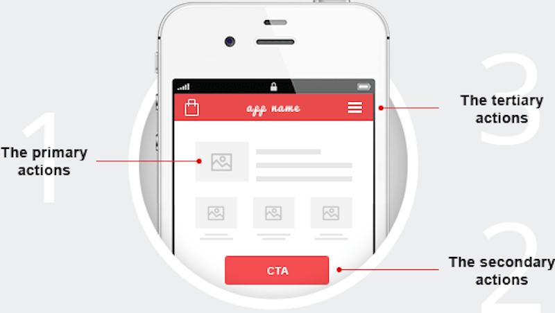
A fundamental behaviour of mobile-device users is to gravitate toward the centre and then scan outwards. They do not scan a page top to bottom and left to right. So it pays to design from the centre outward.
This means leading with the key information in the centre of the page and then working outwards through a hierarchy of probable tasks. Think, if people are on a certain page there is a strong probability that they will want to do a finite number of things next so put them on visible call-to-action buttons, image links, text links, etc.
The science bit…

source: freepik.com
1. The primary actions — addressed by the content in the centre. A fundamental behaviour of mobile phone users is to start from the centre of the screen before moving outwards to find the information they need.
2. The secondary actions — what the user most likely wants to do next. These should be addressed by visible and easily reached call-to-action buttons on the periphery of the page on the top navigation or adjacent to the primary content.
3. The tertiary actions — what users might want, but are less likely to be priorities. This is where your hamburger menu comes in.


