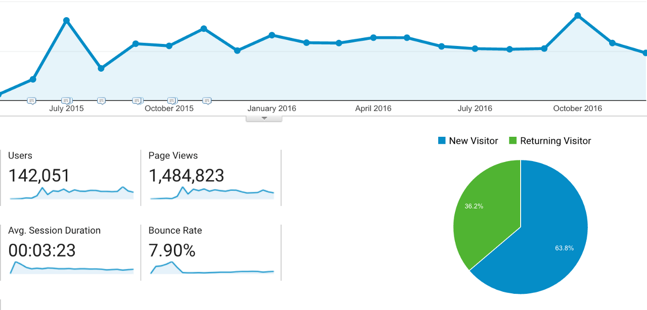
How to design websites with a 7.9% bounce rate

source: freepik.com
Bounce rate = the number of visits in which a person leaves your website from the landing page without browsing any further.
A high bounce rate generally indicates that site entrance pages are not relevant to your visitors, as you have a high percentage of single interaction visits to your website. Hence, anywhere between 26–40% is widely considered to be an excellent bounce rate.
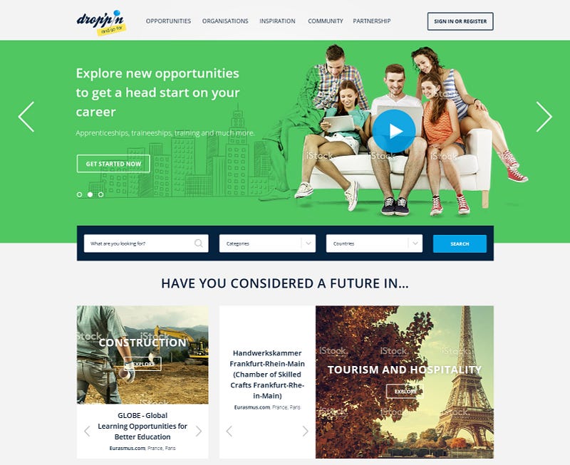
So how did we manage to pull off a 7.9% bounce rate on the European Commission-run website Droppin@EURES?

The simple answer is by giving visitors exactly what they need. The technical answer is Lean Web Design and it starts by listening to the users.
Use the users
Having been tasked with building a platform to promote career opportunities for young people across Europe, the first thing we did was organise a number of focus groups to get to the bottom of the problem we were hoping to solve.
From these listening sessions, we learnt that young people were unclear about what youth opportunities were in the first place; what job sectors or organisations offered them; and how to go about applying for them. Hence, from the start we were solving problems discovered by our users rather than our development team.
Once we put together the first wireframes of the website we went back to these focus groups and let them pick apart the design, showing us what worked and what didn’t. After some modifications, we felt we had something that met the users’ expectations to take into development.
Make constant improvements
But the modifications didn’t stop there, as we were constantly making improvements throughout the project. Using an Agile approach, we were able to breakdown and deliver the functionality in parts, while getting real time reviews from users via direct feedback or performance analytics.
Any confusion in the web design was quickly highlighted or navigation problems easily pointed out, as and when different functionality went live. This meant the website was constantly evolving to remain easy-to-use and well suited to the user needs.
With the end-users dispersed all across Europe, there was a wide range of requirements that couldn’t be defined until the end-users had used the system and started requesting new features, and Agile workflow allowed us to reduce the margin of error in our estimations and provide fast feedback.
Deliver relevant content
Now we know that we’re solving the problems the users want us to solve, in a way that is palatable, the next step is to fill the site with relevant content. No matter how good your site looks or how easy it is to use, the content is what’s going to keep users from leaving after a single interaction or pageview.
The content has to be clear and fulfil the need. For Droppin@EURES,the need was to inform young people about youth opportunities as well as provide education and insight into career development. So every piece of content published on the site had to do at least one of the three.
The content also had to be delivered in ways the user was comfortable consuming so we utilised various media from blogs to videos and podcasts. This combined with the user-friendly design and easy to navigate functionality is also a great contributor to SEO.


