Data visualisation: from communication to decision-making tool
Mapping Emergency Response efficiency in Afghanistan
We recently won a tender organised by IMPACT INITIATIVES, a think-tank which specialises in organising humanitarian aid and support for populations in crisis.
IMPACT INITIATIVES is an on-field think-tank which aims to transform its initiatives into actions on the field. As stated on their website: Field outreach and presence is key to IMPACT, allowing us to collect primary information in contexts of crisis. IMPACT has a permanent presence in over 19 countries and a capacity to deploy to all new crises. IMPACT‘s country teams include IMPACT/REACH Country Coordinators, Assessment and GIS Specialists, as well as large teams of enumerators for data collection. Field staff includes over 100 international experts and 400 national staff.”.
In Afghanistan, IMPACT INITIATIVES collected a wealth of information, sorted by province, in order to assess the efficiency of current and past emergency aid programs.
IMPACT INITIATIVES has been in charge of organising the data visualisation module of The Emergency Response Mechanism (ERM).
ERM is designed to meet humanitarian needs arising across Afghanistan, with a particular focus on ensuring humanitarian assistance is also provided in more remote areas of the country.
IMPACT INITIATIVES decided to use data visualisation to tackle 2 main issues:
- helping new practitioners to have a better understanding of the local provinces that they are about to visit
- identifying segments of the population with specific requirements
IMPACT INITIATIVES then teamed up with WAAT to create an effective data-visualisation portal to transform what was already an effective communication platform into a decision-making tool.
Expert knowledge, UX and data preparation
The first step was to get an expert view on the dataset available in order to select the relevant data and the right type of graphs to use.
IMPACT INITIATIVES team had already worked with the bulk of the data and so we were quickly able to sort out indicators by category and to rank them:
Data sets were classified into 3 categories:
- Household Emergency Assessment Tool (household demographics, additional vulnerabilities, education, livelihoods, food security, WASH, shelter and priority needs)
- Multi-Purpose Cash (a market analysis tool to check whether markets are functional enough to allow a cash-based response)
- Post-Distribution Monitoring (a post-distribution analysis to check the effectiveness of the humanitarian response)
Following this, we ran a detailed UX process to match each data-set with the right type of graphs. The overarching goal was to deliver the information in an accessible manner, with no reduction in the complexity of the data.
With a comprehensive client and a reactive team, we managed to create the UX of the website within a week, iterating through rapid prototyping using Sketch and Zeplin.
In parallel with the UX process, we started tackling another technical challenge: the portal was intended for use in the field in Afghanistan with little or no Internet access.
The site had to work within the following constraints:
- It had to deliver a fast load over slow connections
- It had to work without requiring a permanent internet connection: the scenario we worked with was someone having loaded the website once then wanting to access it at a later stage in an area with low connectivity
Technical details
The front-end solution:
React is the backbone of the application, connecting the front-end and back-end and allowing for granular development and improvement.
Charts are defined and displayed using Recharts which links the d3 library with React.
Some extra d3 libraries have been used in order to provide some more advanced graphs.
The back-end architecture:
For the data structure, we have used mysql as a database and node.js in combination with express to create an api server able to respond to an advanced query and caching.
The caching strategy:
The main objective of the caching strategy was to allow the site to be highly responsive and fully functional if loaded once on the browser, and to minimise the amount of data to transfer from the server to the client.
On the code base side, the whole application utilises dynamic import in React to allow for incremental loading of the application and advanced caching on the client side.
A combination of hashes, id’s, version numbers and timestamps were used to implement an ingenious caching and cache invalidation strategy which ensures that the data served to the client is always up to date and server access is only requested if a connection is available and new data is stalled.
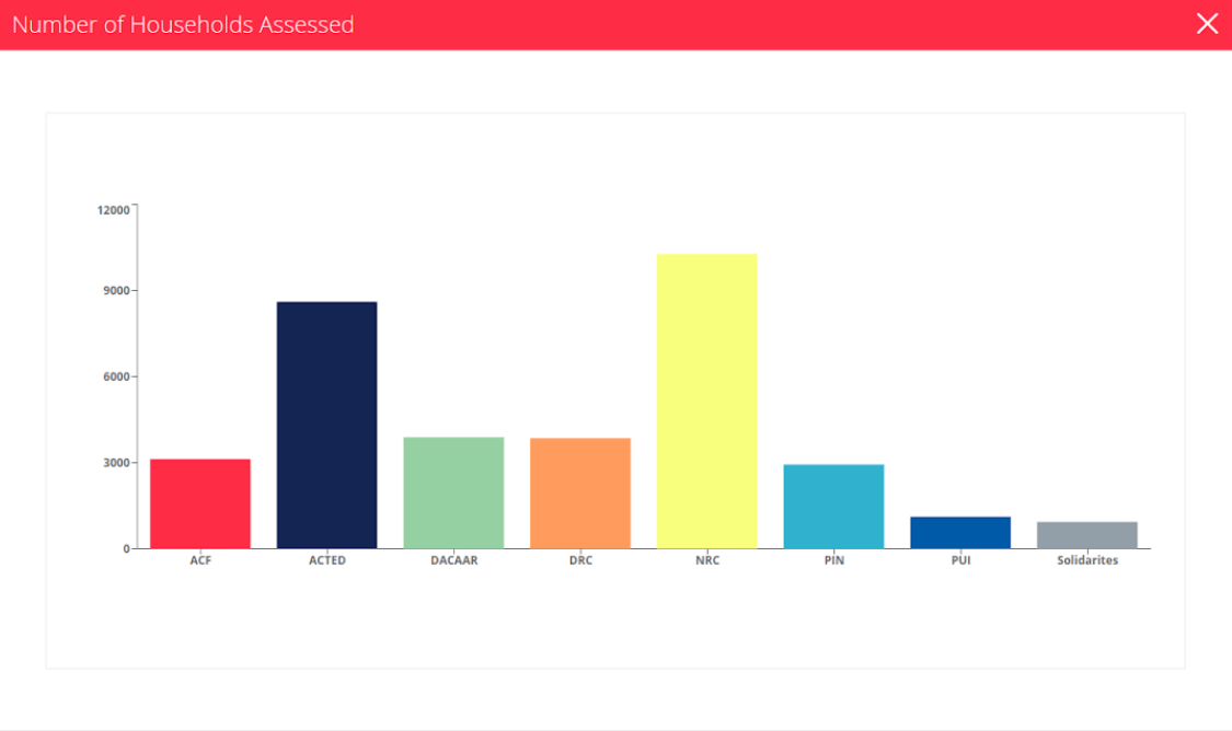
1. A bar chart: number of households
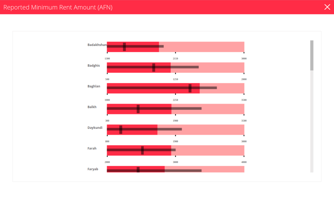
2. A box plot: Reported Minimum Rent Amount
The result
The live site is now available at afg-erm.org and, while being mainly aimed at Afghanistan humanitarian aid practitioners, it is available for anyone to visit and make use of the data provided.
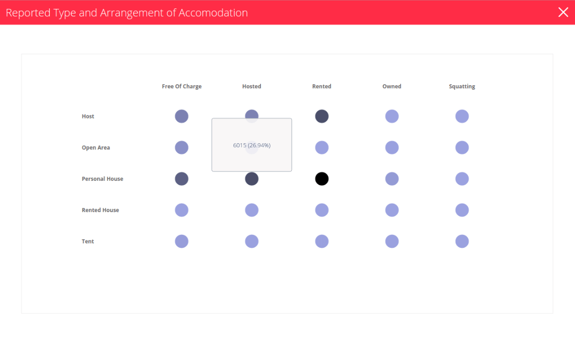
3. A bubble chart: Reported Type and Arrangement of accommodation
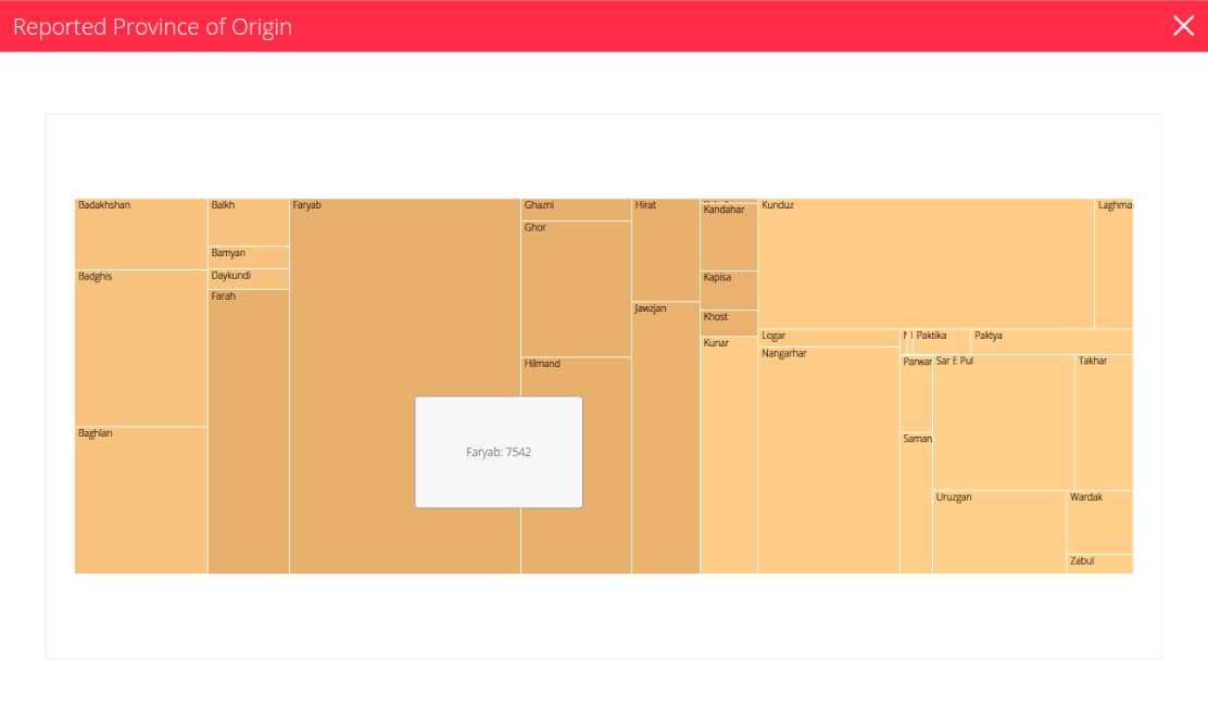
4. A treemap chart: Reported Province of Origin
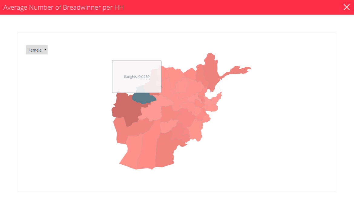
5. Average number of Breadwinner per household
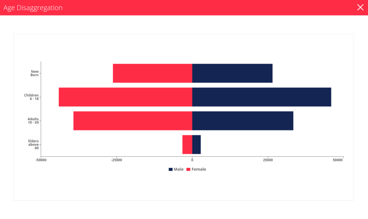
6. Age disaggregation
Our team found that creating an effective answer to this challenging set of requirements was a genuine pleasure. We particularly enjoyed working with experts in such a vitally important field in order to create a solution which is both technically effective and extremely elegant in terms of design.
-

-
WAAT Ltd
Full service digital agency
that adapts to your needs